Step 1. Meta Tag
Most mobile browsers scale HTML pages to a wide viewport width so it fits on the screen. You can use the viewport meta tag to reset this. The viewport tag below tells the browser to use the device width as the viewport width and disable the initial scale. Include this meta tag in the <head>.
<meta name="viewport" content="width=device-width, initial-scale=1.0">
Internet Explorer 8 or older doesn't support media query. You can use media-queries.jsor respond.js to add media query support in IE.
<!--[if lt IE 9]>
 <script src="http://css3-mediaqueries-js.googlecode.com/svn/trunk/css3-mediaqueries.js"></script>
<![endif]-->
Step 2. HTML Structure
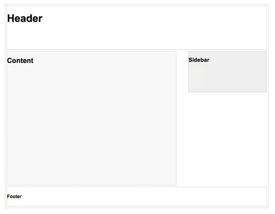
In this example, I have a basic page layout with a header, content container, sidebar, and a footer. The header has a fixed height 180px, content container is 600px wide and sidebar is 300px wide.
Step 3. Media Queries
CSS3 media query is the trick for responsive design. It is like writing if conditions to tell the browser how to render the page for specified viewport width.
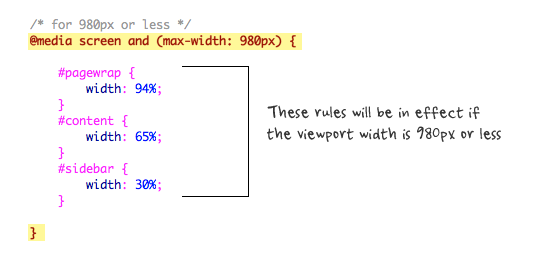
The following set of rules will be in effect if the viewport width is 980px or less. Basically, I set all the container width from pixel value to percentage value so the containers will become fluid.
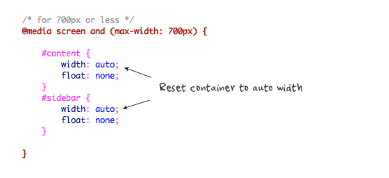
Then for viewport 700px or less, specify the #content and #sidebar to auto width and remove the float so they will display as full width.
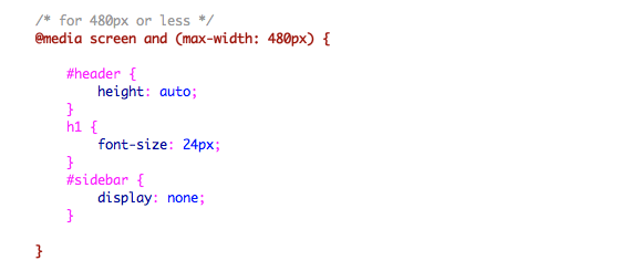
For 480px or less (mobile screen), reset the #header height to auto, change the h1 font size to 24px and hide the #sidebar.
You can write as many media query as you like. I've only shown 3 media queries in my demo. The purpose of the media queries is to apply different CSS rules to achieve different layouts for specified viewport width. The media queries can be in the same stylesheet or in a separate file.
0 comments :
Post a Comment
Write some thing Good for us...........
Note: only a member of this blog may post a comment.